Claim
How did it come about and what is behind it? You can find out here.
The nature of the foot is as natural as it is important to us, because we can only develop good safety shoes if we take this into account. And that is precisely why we entered into the cooperation with Prof. Dr. Gert Brüggemann. When we came to him, he said, “At last a safety shoe manufacturer is coming,” and we asked, Why? “Because all conventional safety shoes are a biomechanical misconstruction that protect the foot from injury on the one hand, but damage it on the other, because they do not take into account the nature of the foot, especially the natural rolling motion.” And it is precisely this conflict, that safety shoes harm because they do not take the nature of the foot into account, that was the beginning of BAAK Go&Relax.
And what do we want to enable the foot to do in our shoes? What should it be able to unbox? Its naturalness.
In German, this would mean: “Entpacke deine Natur”, and in English it means: Unbox Your Nature. This claim inspired and excited us because, on the one hand, it originates in our product and, on the other, we can derive a strategy for our entire company from it – not just for our business model.
Logo
If we look at our claim holistically, our previous logo no longer captures the essence of our organization either.
It is limited only to the business model of creating added value with foot-friendly safety shoes, but ignores other aspects. That’s why we went on a search with Tobias from GAXWEB GmbH to develop our brand holistically into the future. An essential aspect was the way back to the natural, to the open and round appearance of the word mark.
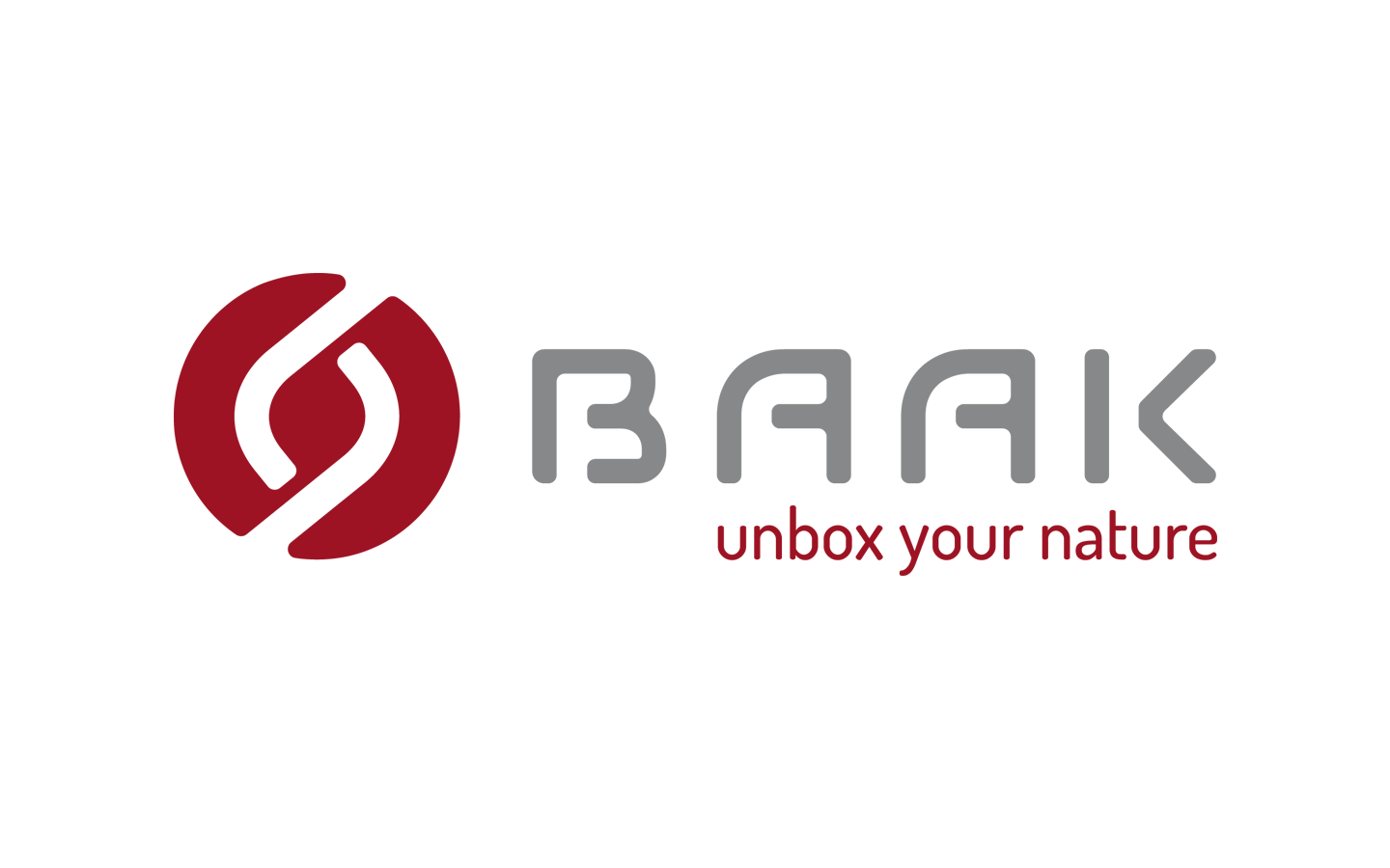
The logo also combines five core elements:
01 The bending lines: The stylized bending lines of the left and right foot are shown.
02 The b: The two bending lines symbolize an oblique b, which stands for us, as an organization.
03 The connection: The two lines intertwine, which shows the connection to our customers, partners and employees.
04 The center: In the middle of the logo there is the center, where the curves find rest.
05 Growth: As growth finds its way from the bottom up, it offers room for development.
We call our logo the BAAK DNA
It characterizes the distinctiveness of our company and of each individual person. Its function is the blueprint for any developmental steps in the entire organism.
Outside world
Our corporate design describes our connection from tradition to the future. The design elements have an outward effect in various areas. Thus, our logo is visible on our new and our existing products. Just as it is on our cardboard boxes.
Our key visual defines...
In addition to our attitude and our trademark, there are other brand elements that support us on the new BAAK-WAY and make us more visible, more tangible and more recognizable. Our key visual, for example. Derived from our brand logo and with the desire to bring dynamism and agility into harmony, we use our new key visual flexibly on all our media.
Our key visual is an impressive key image that is clearly associated with our BAAK brand. It was important to us not to develop just another interchangeable design element, but to combine content, form and attitude and to make our overall image more rounded in the truest sense of the word. In this way, the individual brand elements form an inseparable unit with our characters, fonts, colors and key images. For us, this is the path to consistent brand management.

